3.31. Textboxes
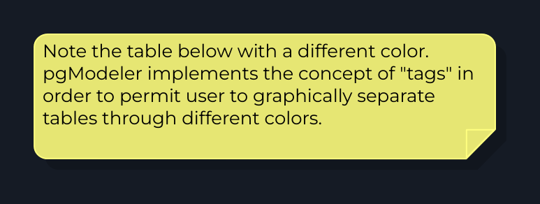
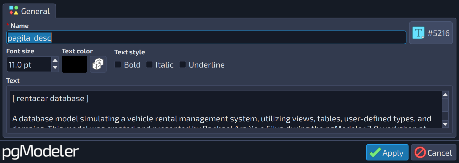
Textboxes are simple objects whose purpose is to create small reminders or documentation over the model. These objects can have a custom font style per instance, giving the user freedom to create several objects with their customized appearance (see below). The only exception is that the background color is tied to the global appearance settings.
Textboxes can be freely resized by the user. The initial width of the object will be defined by the width of the text input in the text box editing form. Once the object is created, just click it in the canvas area (keeping the left mouse button pressed), hold Shift, and move the cursor to determine a new width for the text box. Only the width can be adjusted by the user because the height is determined based on the new width specified by the user during the resize movement.
 123456
| General | ||
|---|---|---|
| # | Field | Description |
| 1 | Font size | Font size, in points, used by the textbox text. |
| 2 | Text color | Color of the textbox text. |
| 3 | Bold | Draws the textbox text in bold. |
| 4 | Italic | Draws the textbox text in italic. |
| 5 | Underline | Draws the textbox text underlined. |
| 6 | Text | The text shown in the textbox. Line breaks typed in this field are kept. The initial width of the textbox is the width of this field, and long lines are wrapped at that width (the width can be changed later on the canvas, as described above). |