4.2. Appearance settings
This widget is used to configure the UI general style, font, and color settings for graphical objects as well as to define the source code font and highlight settings.
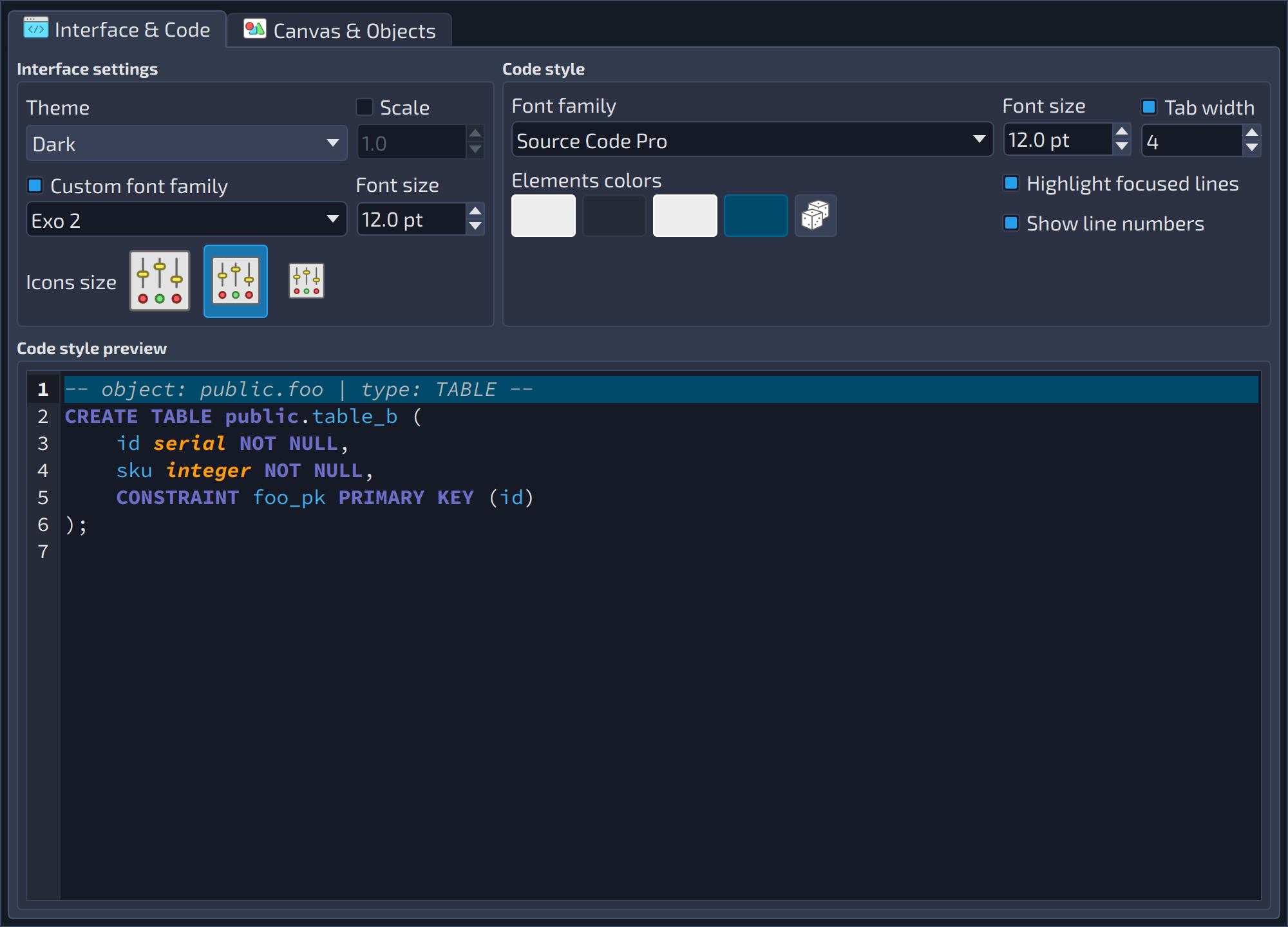 1234567891011121314151617181920
| Interface & Code | |||
|---|---|---|---|
| # | Field | Group box | Description |
| 1 | Scale | Interface settings | Defines a custom UI scale factor, applied when drawing widgets and fonts. It requires restarting pgModeler to take effect. |
| 2 | Tab width | Code style | Enables a custom tab width in the source code fields. |
| 3 | Theme | Interface settings | Specifies the theme of the user interface. A theme changes the colors of the widgets as well as the syntax highlighting configuration of the source code fields, so they match. |
| 4 | Scale | Interface settings | Defines a custom UI scale factor. This factor is applied when drawing widgets and fonts. Requires restarting pgModeler when in use. |
| 5 | Font | Code style | Defines the font family used in all the fields that display source code. |
| 6 | Size | Code style | Defines the font size used in the source code fields. |
| 7 | Tab width (characters) | Code style | The width of a tab in source code editors, in characters. Enabled when the check box |
| 8 | Custom font family | Interface settings | Defines a custom UI scale factor. This factor is applied when drawing widgets and fonts. Requires restarting pgModeler when in use. |
| 9 | Highlight focused lines | Code style | Highlights, with a different background color, the line where the cursor is in the source code fields. |
| 10 | Custom font family | Interface settings | Defines a custom UI scale factor. This factor is applied when drawing widgets and fonts. Requires restarting pgModeler when in use. |
| 11 | Custom font size | Interface settings | The size of the custom user-interface font, in points. |
| 12 | Line numbers' font color | Code style | The font color of the line numbers in the source code editors. |
| 13 | Line numbers' background color | Code style | The background color of the line numbers area of the source code editors. |
| 14 | Line numbers' highlight font color | Code style | The font color of the line numbers of the highlighted lines. |
| 15 | Highlighted line color | Code style | The background color of the highlighted (focused) line. |
| 16 | Show line numbers | Code style | Toggles the line numbers in the source code fields. |
| 17 | Icons size | Interface settings | Uses big icons in the user interface. The buttons |
| 18 | Icons size: medium | Interface settings | Uses medium icons in the user interface. |
| 19 | Icons size: small | Interface settings | Uses small icons in the user interface. |
| 20 | Code style preview | A sample of source code that shows how the current code style settings look. | |
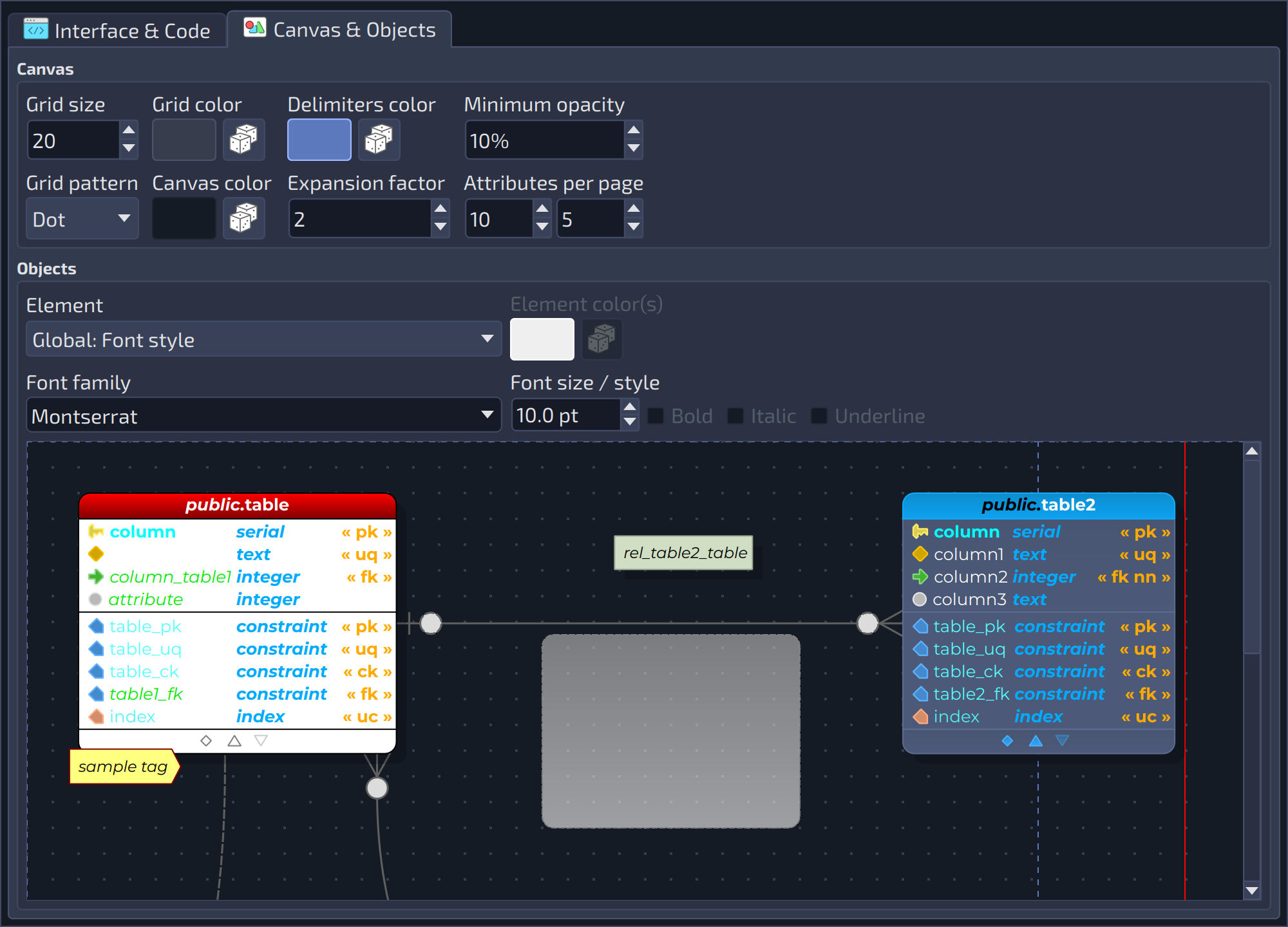 12345678910111213141516
| Canvas & Objects | |||
|---|---|---|---|
| # | Field | Group box | Description |
| 1 | Grid size | Canvas | Defines the vertical and horizontal size of the grid (from 10 to 100). This value affects the spacing of the objects when the feature that aligns the objects to the grid is used. |
| 2 | Grid color | Canvas | Defines the color of the grid lines. |
| 3 | Delimiters color | Canvas | Defines the color of the page delimiter lines. |
| 4 | Minimum opacity | Canvas | Defines the minimum opacity percentage (from 0 to 70) applied to the objects when the fade-out feature is used. An opacity of zero hides the objects completely, so it is not possible to interact with them in the canvas area. |
| 5 | Grid pattern | Canvas | Defines the pattern used to draw the grid: |
| 6 | Canvas color | Canvas | Defines the background color of the canvas area. |
| 7 | Expansion factor | Canvas | The expansion factor is the number of times the current page dimension (width and height) is used to expand the canvas geometry to a certain direction (top, left, bottom, or right). The page dimension can be adjusted in the printing options. |
| 8 | Attributes per page | Canvas | These two fields define the minimum number of attributes visible per page in each section of the tables and views when pagination is enabled on them. The first one controls the number of columns per page; the second defines the number of extended attributes (constraints, indexes, triggers, rules, and policies) per page. |
| 9 | Extended attributes per page | Canvas | Minimum number of extended attributes (constraints, triggers, rules, indexes, and policies) displayed per page of a table. |
| 10 | Element | Objects | Selects the style item (an element of the canvas objects) that is being configured. |
| 11 | Colors | Objects | Defines each color attribute for the current element. For graphical objects, there are three configurable colors. The first two are the fill color (gradient) and the last one is the border color. For font style elements, there is only one color available, which is the foreground color. |
| 12 | Font | Objects | Defines the font family of the current element. The font size (in points) and the bold, italic, and underline styles can be configured beside it. |
| 13 | Font size | Objects | The font size, in points, of the current element. |
| 14 | Bold | Objects | Draws the text of the current element in bold. |
| 15 | Italic | Objects | Draws the text of the current element in italic. |
| 16 | Underline | Objects | Draws the text of the current element underlined. |
Themes
The field Theme of the tab Interface & Code lists the available themes, which define the colors of the user interface (windows, menus, tooltips, scrollbars, tabs, buttons, and so on) as well as the defaults of the canvas and of the code highlighting:
| Theme | Description |
|---|---|
| System default | Based on the color settings of the operating system. |
| Light | Light color scheme for the user interface components. |
| Dark | The new pgModeler 2.0 dark color scheme. |
| Classic Dark | Dark color scheme based on the dark theme of pgModeler 1.0. |
| Ink Saver | Light color scheme with black and white model objects, to save printer ink when printing models. |
Creating a custom theme
Every theme except System default is a folder inside the directory conf/themes of the pgModeler installation (the same directory where the folder conf/defaults lives). To create your own theme:
- Copy one of the existing theme folders (for example,
dark) insideconf/themesand give it a new name; the name of the folder is the identifier of the theme. - In the new folder, edit the file
theme.conf: the attributenameof the root element is the name displayed in the comboTheme, the elementdescriptionis the description, and the elementspalettedefine the colors of the interface (one element per color role, with the colors for the states active, inactive, and disabled). - Optionally, adjust the other files of the folder, which follow the same format as the corresponding settings files:
appearance.conf(canvas, objects, and code editor appearance),pattern-highlight.conf,sql-highlight.conf,xml-highlight.conf, andsch-highlight.conf(code highlighting), andextra-ui-style.conf(additional style rules of the interface). - Restart pgModeler and select the new theme in the combo
Theme.
A theme folder that lacks any of the files appearance.conf, pattern-highlight.conf, sql-highlight.conf, xml-highlight.conf, or theme.conf is ignored and is not listed. Since the themes live in the installation directory, keep a copy of your custom themes when upgrading pgModeler.