3.30. Tags
Tags are objects whose goal is to separate graphically objects without the need to change their schemas. Since schema objects surround all its children in a rectangle denoting that those objects are part of the same context this can be an undesired behavior depending on the model being created because the user sometimes needs to separate objects in a graphical way but not necessarily by moving the objects to the same namespace. This is where the tags can be used, they have the ability to put tables and views in the same visual contexts without demanding any attribute changes on the involved objects.
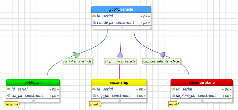
The image below gives an example of tag usage. Note the tag-like object at the bottom of each table. This is the graphical representation of tags. Also, note that we have four tables but each one with its own color pattern (by default tables have the same color), this is another effect of assigning a tag to a table or view: a tag always overrides the default color configured for the objects.

Finally, tags have no meaning in SQL scope so when generating this kind of code all tags and their associations to tables and views will be completely ignored because tags are stored only in XML format playing their role just at design time. Below, all attributes for tags are described.

| Attribute | Description |
|---|---|
Colors |
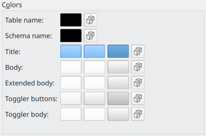
This group of fields is used to set colors for all tag attributes. |
Table name |
The foreground color of the table name portion on top of a table or view object. |
Schema name |
The foreground color of the schema name portion on top of a table or view object. |
Title |
The fill color of the title object on top of a table or view. This attribute accepts three colors: the first two are used as a gradient filling and the last is the object border color. |
Body |
The fill color of the body object (where columns reside). This attribute accepts three colors: the first two are used as a gradient filling and the last is the object border color. |
Extended |
The fill color of the extended body object (where constraints, triggers, rules, and indexes reside). This attribute accepts three colors: the first two are used as a gradient filling and the last is the object border color. |
Toggler buttons |
The fill color of the extended body toggler buttons. This attribute accepts three colors: the first two are used as a gradient filling and the last is the object border color. |
Toggler body |
The fill color of the toggler buttons body object. This attribute accepts three colors: the first two are used as a gradient filling and the last is the object border color. |